What are Landing Pages?
The name ‘landing page’ is basically meant to represent a scenario in which the visitor comes to your website and lands on that specific page making it an effective entry point to your website.
Now, what landing pages are about is grabbing those visitors and convincing them to take care of a given predefined action. In most cases, this is about getting them to subscribe to an email list, click a specific link or button, buy a product, or perform some kind of social-media-related activity (like clicking the re-tweet button).
In other words, the goal is to take new visitors and immediately put them through some marketing process on your website, as opposed to let them wandering around, looking for something to do.
What Makes Landing Pages Special?
Of course, you don’t actually need to create a landing page to try convincing your visitors to take some specific action. You can do so from any kind of page which is built inside the website or even from the homepage of the site itself.
But the landing page website is different. Due to its single-purpose nature, it will bring better results when executed properly. At the same time, the standard homepage is not good for such purposes, because it’s usually built in a way that tries to present a load of different things and information.
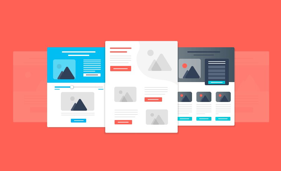
The most interesting thing about landing pages is their design, or more accurately, lack of it. Most landing pages are very minimalistic. At least in a way that they are implemented these days. They are usually built separately from the rest of the website and get very little of the website’s original design. And sometimes it’s not really good.
In short, every element which appears on a landing page should reinforce the main goal of the page, namely to get a specific action from the visitor. Everything else should be erased, but the whole design itself should not suffer. You can’t just put the entire content on the white background and start your marketing. Of course, you can do this, but don’t expect high conversions from that type of landing page website. You’ll probably get a disaster instead.
Check out this video to understand the difference between Landing Pages and regular websites. It will help you to create a landing page that can become a great asset for your business.
Types of Landing Pages
There are 4 major types of landing pages:
- Lead Generating or Lead Capture Landing Pages
- Click-Through Landing Pages
- Sales Pages
- Launch or Coming Soon Pages
Lead Generating or Lead Capture Landing Pages
This is the very basic type of landing page. The purpose of lead generating pages is to capture visitor’s email address and other contact details to market or reach them out in the future. The page offers some value, as an eBook for the target audience, in exchange for their contact details. Some of the best scenarios of using these landing pages are:
- Consultation for professional services
- eBook & Whitepaper downloads
- Access to Video Tutorials
- Subscribing on Webinars
- Free Trials
- Discount Vouchers
Click-Through Landing Pages
As the term indicates, the goal of Click Through Landing Pages is to direct the user to another page. It’s widely used by the eCommerce websites to persuade users to the specific product page.
These are the pages, usually located on eCommerce websites, and used to promote clicking through to the next page where the sale can be made. Consider them as teaser pages that warm up the client for the main offer you’ve prepared.
Despite they’re generally used in eCommerce, they can be adapted to other funnels such as digital products. Click through pages to educate the visitors beforehand, hence increase the chances of conversion. You can also create a landing page such as this if you have a membership project. Those pages are commonly used by membership and SaaS projects to warm up prospects before sending them to registration pages.
Sales Pages
Sales Pages make a huge impact on your website. They are the most important pages. This is the place of making money and it consequently has the lowest conversion rate. On average, eCommerce sites have a 2%-4% conversion rate and SaaS companies have 3%-5% conversions. Meantime, your product or service could be a necessity, novelty, or other –ty which makes it convert much higher.
Launch or Coming Soon Pages
Launch pages are very popular now amongst startups. They help to setup launch or coming soon pages to get email addresses of people interested in the services. This allows us to market them when the service is available in the future and helps to build a database of prospective subscribers and buyers.
What You Should Avoid on Your Landing Page
When you create a landing page, it can survive almost anything except for the mistakes which will be outlined here. If you commit them, you will see conversion rates plunge, cost per action rise, and abandonment rate skyrocket.
None of those are outcomes we were looking for so let’s dive into the mistakes and what to do about them.
1. Not Focused
Above all, the first thing to look at is whether your landing page website is focused or not. Does it convey the only one message and solely that certain message? Are all of the elements you’ve added to your page moving your prospect closer to the ultimate goal?
If not, scrap them. They’re hurting you more than they’re helping you. Pay huge attention to your message, your sales copy.
From the very first line to the last one there must be a single goal for them which is to buy what you’re selling. Even if it’s a lead-generating page you’re selling something they have to buy. The price may be in real dollars or it can be as cheap as an email address.
Stay focused and clear about the goals. That will definitely help you to create a landing page and get higher conversions.
2. Awful Headline
The headline is one of the most important parts of the first screen your visitor looks at. The make or break portion of your page. It’s been widely quoted that 5x more people read the headline than the body copy.
The reason why headlines are so important is that because people don’t have time. Online, everything is free so we’re not obligated to sit down and listen or read anything.
Make sure your headline demonstrates your main offer as clear as possible, and as stronger as possible. Your prospects must understand the value for them to keep scrolling further and discover the product you provide.
Keep in mind that you should spend just as much time on a headline as you spend on the body copy. If you’ve spent an hour crafting your landing page website, then you should spend an hour or more crafting your headline.
Want to create a landing page that immediately catches visitor’s attention? This post may help you in creating a winning headline.
3. Too Many Elements
Every element you add is another opportunity for distracting your visitor. We’re already distracted enough when we’re online. Your visitor’s phone is sending them a dozen WhatsApp messages,
Instagram is telling them they’ve gotten a hundred likes on their last picture, and Twitter is informing them about the latest viral trend.
We can’t compete. The last thing you want to do is distract their attention even more. That slide in optin form you wanted to incorporate – don’t.
The human brain can process only about 110 bits of information per second. A normal conversation takes about 60 bits of neural processing capacity. That’s why it’s hard to use your phone and have a meaningful conversation at the same time.
Every element on your landing page takes up a few bits of information above and beyond what they’re using to read. Make it easy for your visitors. Allow them to go through the process with as little effort as possible. Remove any distractions that may lead the user away
They will thank you and your conversion rate will thank you.
4. Too Many Offers
The choice is an absolute killer of your conversion. The choice doesn’t make us happier, it makes us more miserable. Every time we make a choice, we’re missing out on what we didn’t choose. Opportunity cost and buyer repentance are at the highest level.
There are times when the choice is good. You get to choose your career path. You get to choose what you eat for dinner. You get to choose your life partner.
Your landing page isn’t one of those situations. The more choices you have, smaller your conversion rate. Your job is to narrow it down to a single option. Either they say yes or they say no.
You can also give them more variations for the same option. Marketers call it the illusion of choice.
If you’ve got a big-ticket item, then you can give them an option for payment plans. What you never want to do is introduce two different offers together. That would be bad.
Remember just one simple thing about humans: when humans are faced with too many choices, they do nothing. That’s not what you want them to do on your landing page website. So do it wisely. Create a landing page that gives your visitors only the choices you want them to choose.
5. Being Lazy
The last piece of the landing page killing puzzle is the way you create that page. The effort you put in shows.
Your design, the words you use (and don’t use), the presentation, the length, etc. all play a part in the conversion rate of your website. Did you know 80% of your visitors stay above the fold?
The reason why is simple. Most pages don’t give their visitors a reason to keep scrolling. In the early days of the internet, web users weren’t conversant with the way the internet was laid out. They didn’t scroll.
Now, they do scroll, but only if it’s worth their time. They’ll also read everything you write – if it’s worth their time. Make it worth their time by clearly spelling out what you’re offering and being clear about the benefits (and upfront about what you’re not offering).
The point is that you have to be clear. Never assume anything. Be excruciatingly detailed and above all stay focused on your message.
Essential Elements to Create a Landing Page that Converts
Creating an effective and highly converting landing page in itself takes a lot of research, experiments, learning, and improvements. However, there are some no brainers, that you must pay attention to.
6. The Offer
Even if you’ve crafted the best headline, the perfect copy, and the most powerful testimonials your offer can kill conversions.
The more you want people to give you, the better your offer needs to be.
It’s the beginning of your close. When you present the offer, it’s time to start pulling out all those copywriting tricks to close the sale.
Whether your offer is free or paid, you’re still selling something. It has to be more valuable than what they’re giving up (email/money) to get it.
You can show your offer as soon as they visit your page or you can ease into it. As a rule of thumb, paid offers are eased into and free offers are presented upfront. This isn’t written in stone. When you create a landing page, do your own tests to see which one works better for you.
7. Clear Call to Action
Never assume. Don’t think your prospect knows the next step they’re supposed to take. No matter how clear it is to you, it can be like Arabic to your visitor.
The call to action is another opportunity for you to boost conversions. Even though it’s not a make or break portion of your page, it can have a significant impact on whether or not your prospect follows through with your desired action.
Craft your call to action with clear language when you create a landing page. Leave no room for confusion. When possible, keep it under three words. Examples of calls to action are as follows:
“Get Access to X” – Get Access to the Udevv Digital consultation.
“Get your Copy of Y” – Get your copy of the Udevv Digital SEO best practices.
“Start my Z” – Start my successful business with Udevv Digital.
A great way to bring attention to the call to action is to make it with an attractive bright color. For example, you can use an orange call to action button on a light-blue page. It’ll stand out and draw the eye immediately.
Piled up with clear language that will make sure your audience is able to find and understand the element that’ll take them to the next step.
This is the last action your prospect takes before sign up or payment. Sometimes a simple proceed to checkout is all you need in order to keep them moving. Other times, you’ll have to get more creative.
8. Social Proof and Testimonials
When we’re in doubt, we follow the crowd. It’s called the bandwagon effect and it’s a real psychological phenomenon.
Testimonials are the most common type of social proof but celebrity endorsements and client logos also work well. Not every testimonial you get will check off all three boxes when it comes to being specific, backing up your claims, and comparing your product to competitors.
You are a handful of testimonials telling different things. One will mention one of your claims. Another one will compare your product to a competitor. A different one talks about a specific benefit. This is good. It shows the variety in your customer base and the utility of your product.
Make sure you have social proof when you create a landing page.
9. Graphics, Images, and Videos
Images support your message. They never take away from it. Your images add information when words would be a poor replacement.
Let the image support your headline. Your headline is a promise. It makes sense when the images and graphics on the page support that promise. Put the image that describes your product. Or even add a video that tells about your product.
Video is the most powerful tool to increase your landing page conversion. Short animated video can play a big role on your landing page website and convert it instantly, but only in case if your video is well-structured and created by professionals.
Your image should never overpower the headline. When you create a landing page, make sure your images and videos are placed in the right way to get higher conversions.
10. Features and Benefits
Features and benefits can be difficult to sort out and easy to confuse – especially when you’re close to the message.
Features are facts about what you’re offering.
Benefits are the ways it helps them to achieve their goals, needs, and desires.
Ask yourself “and so what?” when it comes to each benefit or feature you think you have.
Let’s say you’re selling phones and one of the features of the phone is 128gb of memory capacity. No matter what your goals or feelings are about the phone, it’ll always have 128gb of memory.
The phone has 128gb of memory.
And so what?
So you can store more things.
And so what?
Life is less stressful. You don’t have to worry about what you download or store because there’s enough space to locate it. Take as many pictures, record as many videos, and install as many games as you want, keeping in mind that your phone will always have room for more.
You can do the same simple process when you create a landing page for any industry. It works everywhere.
Conclusion
Landing pages are standalone web pages distinct from your main website which has been designed for a single focused objective.
Digital marketing and advertising are highly defined by landing pages. The landing page is a dedicated page on your website, solemnly created for using them as a part of your digital marketing and/or advertising endeavors.
The Landing page is the point on your website where your audience and/or new visitors are being redirected upon clicking on the link that corresponds to the desired landing page. So make sure you make it simple, attractive and understandable for your prospects. Definitely they will thank you for that.
What is the best way to promote your product on a landing page? Do you want to create a landing page to provide your service for more people? How to get more clients to contact you through the landing page? Does your landing page attract your prospects? If you aren’t sure or you don’t know, complete our questionnaire and get a free strategy consultation from us.
General FAQ
What is a Landing Page?
The name ‘landing page’ is basically meant to represent a scenario in which the visitor comes to your website and lands on that specific page making it an effective entry point to your website.
The goal is to take new visitors and immediately put them through some marketing process on your website, as opposed to let them wandering around, looking for something to do.
What types of Landing Pages exist?
There are 4 major types of landing pages:
– Lead Generating or Lead Capture Landing Pages
– Click-Through Landing Pages
– Sales Pages
– Launch or Coming Soon Pages
What is the most important type of a Landing Page?
Sales Pages make huge impact on your website. They are the most important pages. This is the place of making money and it consequently has the lowest conversion rate. On average, Ecommerce sites have a 2%-4% conversion rate and SaaS companies have 3%-5% conversions. Meantime, your product or service could be a necessity, novelty, or other –ty which makes it convert much higher.
What are the best practices to create a Landing Page that converts?
Here are the most important elements you need on your Landing Page if you want to get highest conversions:
– Create an Understandable Offer
– Make sure you have Clear Call to Action
– Put some Testimonials and Social Proof from your clients
– Demonstrate catchy Graphics, Images, and Videos to visitors
– Tell more about your Features and Benefits
